Our perception of oceans, rivers, and water infrastructure is shaped not just by experience or education, but by how these systems are visualized. From 16th and 17th century maritime maps to today's satellite data dashboards, water imagery has long reflected the values, priorities, and technologies of its time. Yet many of these representations erase ecological complexity, exclude community voices, and obscure the governance structures shaping environmental outcomes.
This case study traces the evolution of water and ocean imagery, analyzes its influence on public understanding and policy, and proposes a new approach to designing visual tools that are more inclusive, accurate, and empowering. Drawing from a visual content analysis of historical and contemporary imagery, it culminates in a proposed interactive map that integrates natural and human-managed water systems, infrastructure, ecological processes, and policy layers.
Grounded in critical cartography, environmental communication, and decolonial mapping practices, the proposed solution seeks to bridge abstraction and emotional resonance, policy and ecology, oceans and drinking water. It is a design not only for communication, but for environmental justice and civic engagement.
Visual Evidence: Historical and Contemporary Water Imagery
This project analyzed over 15 historical and contemporary water/ocean visualizations, selected for diversity in style, audience, and time period. Below are the primary sources organized by era and type.
16th & 17th Century Nautical Charts
19th & 20th Century Marine Atlases & Scientific Illustrations
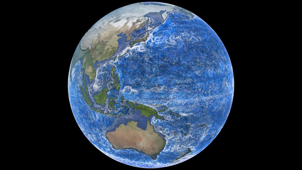
Satellite & Data-Driven Maps (NASA, NOAA, ESRI)
The LEVITUS data set represents objectively analyzed fields of major ocean parameters, such as temperature, at the annual, seasonal, and monthly time scales. Researchers at GFDL/NOAA rely on such empirical results as a basis for theoretical development.

Argo Profiling Float Data
94% of data collected by profiling floats is available online within 24 hours. Used by researchers worldwide for ocean temperature and salinity tracking.
www2.whoi.edu →
GIS for Ocean Hub (ESRI)
Connect with the Oceans Community through ESRI's Ocean Hub — a central platform for ocean-focused GIS data, tools, and collaboration.
oceans-esrioceans.hub.arcgis.com →Advocacy & Educational Infographics
Baltimore Water Watch
Baltimore Water Watch maps water quality in Baltimore's streams, rivers, and Harbor. Water health is scored to answer the question, 'How's the Water, Hon?'
baltimorewaterwatch.org →Infrastructure Maps
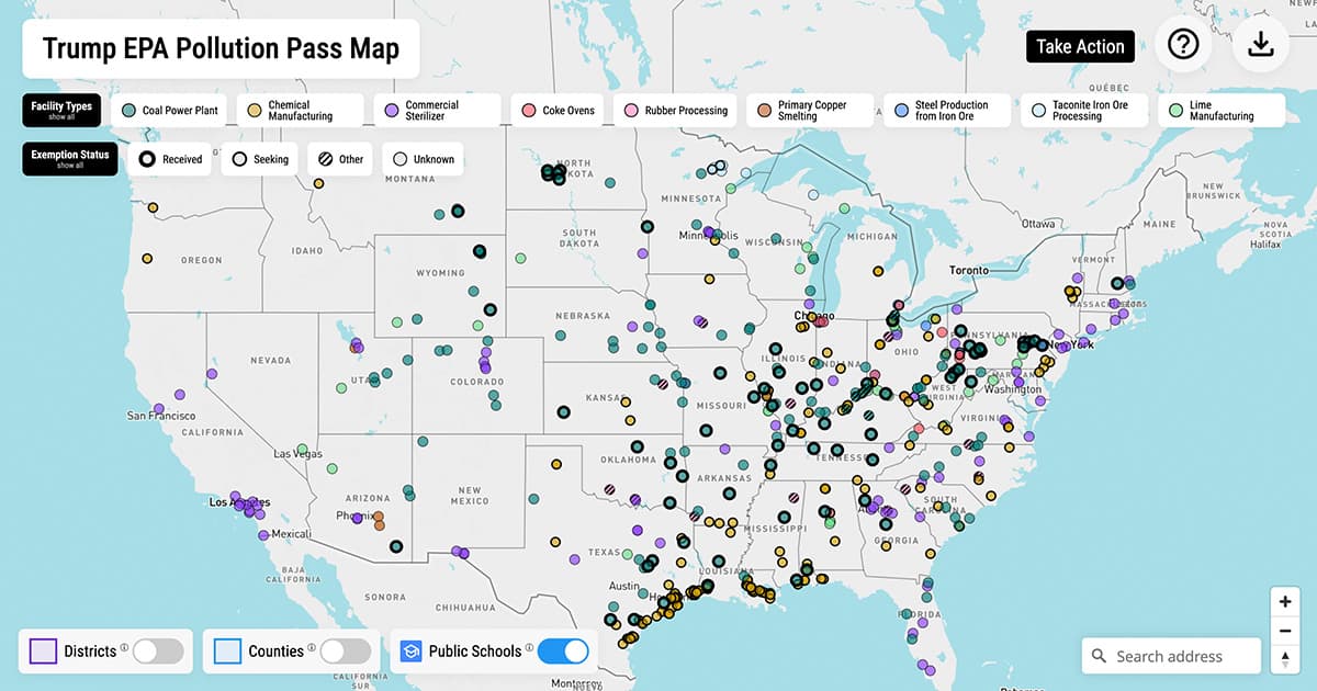
EPA Pollution Pass Map 2025
A map of 500+ industrial facilities showing whether they've requested or been granted an EPA pollution exemption, who lives nearby, and more.
www.edf.org →
USGS National Water Information System Mapper
Water Resources of the United States — National Water Information System (NWIS) interactive mapper for water monitoring stations.
maps.waterdata.usgs.gov →The Problem: Gaps in How We Visualize Water
Visualizations play a critical role in how people perceive and engage with environmental issues. Yet, dominant water and ocean imagery often fail to represent the full story. Scientific visualizations emphasize accuracy and scale but frequently abstract away lived experience. Colonial-era maps prioritized control and extraction, ignoring Indigenous knowledge systems. Even contemporary infographics can oversimplify, using emotional appeals that may overwhelm rather than engage audiences.
These gaps are particularly harmful in the context of climate change and water degradation, where public understanding is essential to building support for policy and conservation efforts.
Findings: Three Dominant Patterns
1. Scientific Abstraction → Detachment
Data-rich visuals from institutions like NOAA and NASA often represent oceans as temperature grids, salinity charts, or flow models. While technically precise, these images tend to abstract marine systems into impersonal datasets, detaching viewers from the ecological urgency and lived impacts of climate change.
2. Colonial Aesthetics → Erasure
Historical maps from colonial and industrial eras prioritized shipping routes, naval control, and resource extraction. These visuals systematically ignored Indigenous place names, local ecosystems, and community governance — creating a visual ideology of oceans as “empty” or “neutral,” ripe for exploitation.
3. Activist Reframing → Oversimplification
Contemporary infographics often rely on dramatic, fear-based imagery or anthropomorphized marine life. While emotionally effective, they may oversimplify complex systems and fail to connect ecological damage to structural causes or policy solutions.
Proposed Solution: An Interactive Map
To address these gaps, I propose a conceptual prototype for a public-facing interactive map that visualizes both natural and human-managed water systems. Unlike traditional tools designed for technical users, this map prioritizes accessibility, ecological complexity, and policy literacy.
Multi-Scale Navigation
From global ocean currents to local sewer overflows
Layered Visuals
Toggle views of aquifers, biodiversity hotspots, infrastructure, Indigenous territories
Custom Views
Personalized maps by location, interest, or community
Narrative Panels
Pop-up stories from Indigenous, rural, and coastal communities
Policy Context
Jurisdictional overlays + plain-language law summaries
Accessible Design
Plain language, icon support, and layered help content for non-expert users
Theoretical Frameworks
Maps reflect power and ideology, not just geography
Visuals shape public understanding and emotional response
Centers Indigenous knowledge and lived experience
Uses story structure to guide users through complex data
Emphasizes clarity, interactivity, and usability for all audiences
Reflection & Next Steps
This project taught me how critical design decisions — framing, audience, interactivity — shape public understanding of environmental systems. It also showed the need to balance narrative power with ecological accuracy, and to ground claims in evidence and theory.
If I continue the project:
- Build a working prototype using ArcGIS Story Maps or Mapbox
- Conduct usability testing with stakeholders
- Collaborate with environmental groups for co-design
What I would do differently:
- Begin image analysis earlier to deepen insights
- Quantify findings more clearly
- Include more scholarly sources
- Design visual examples for each critique
Limitations
- Sample size (both visual and audience data) is limited
- No functioning prototype currently exists
- Analysis lacks formal statistical validation
- Project scope constrained full community co-design or participatory evaluation
Conclusion
Visuals are not neutral — they are tools of knowledge, emotion, and power. As the climate crisis deepens, our maps must evolve. This case study proposes a new approach to visualizing water: one that integrates ecological systems, governance structures, and community stories in a dynamic, inclusive, and informative way. By making invisible systems visible, and by challenging dominant visual traditions, we can foster a more engaged public and a more just water future.
References
- Crampton, J. W., & Krygier, J. (2005). An introduction to critical cartography. ACME: An International E-Journal for Critical Geographies, 4(1), 11–33.
- Harley, J. B. (1989). Deconstructing the map. Passages, 3(8).
- Hullman, J., & Diakopoulos, N. (2011). Visualization rhetoric: Framing effects in narrative visualization. IEEE Transactions on Visualization and Computer Graphics, 17(12), 2231–2240.
- Louis, R. P. (2017). Indigenous mapping and counter-mapping. The Canadian Geographer, 61(1), 29–45.
- MacEachren, A. M. (2004). How maps work: Representation, visualization, and design. Guilford Press.
- O'Neill, S., & Smith, N. (2014). Climate change and visual imagery. Wiley Interdisciplinary Reviews: Climate Change, 5(1), 73–87.
- Turnbull, D. (2007). Maps, narratives, and trails. Geographical Research, 45(2), 140–149.
- Wood, D., & Fels, J. (2008). The natures of maps: Cartographic constructions of the natural world. University of Chicago Press.